Step-by-step tutorial
Custom reports are a great way for analysing and communicating Enterprise Architecture insights of your organization in an effective way.
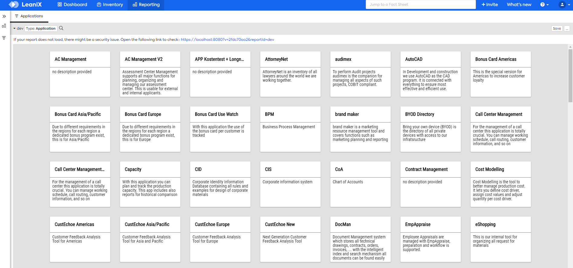
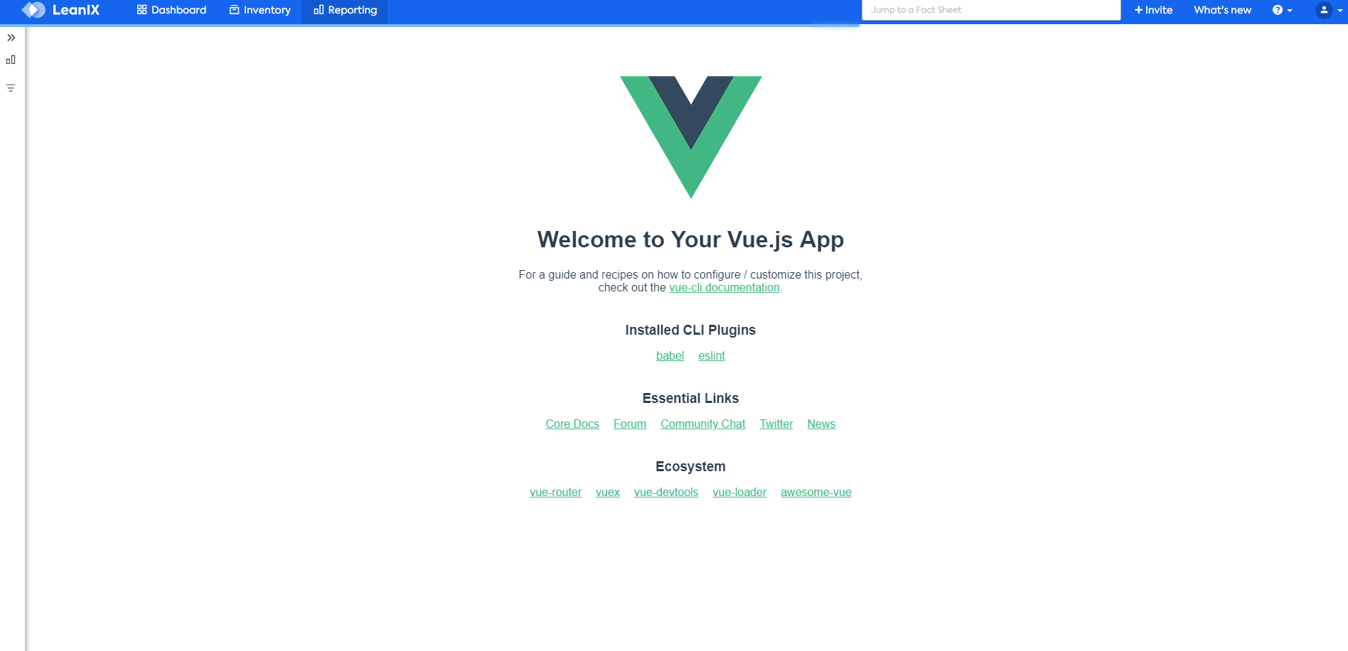
In this step-by-step tutorial we create a simple LeanIX custom report from scratch, using Vue, that will list all application factsheets of a workspace as cards as in the picture below:
The source-code for this project can be found here.
Create a Vue project
We start by creating a Vue project from scratch using the following command:
# create a new Vue CLI 3 project
vue create my-custom-report
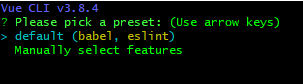
A first dialog is presented. For our demo project we select the default option.
After confirming your answer, wait until the project is created and all dependencies are installed.
Install the Vue CLI LeanIX plugin
After our project is created and all dependencies are installed we switch into the project folder and add the Vue CLI LeanIX plugin to it:
# switch into the project folder
cd my-custom-report

# add the vue cli leanix plugin to the project
vue add leanix
Some questions regarding the custom report are then presented to the user. Answer them according your case.

TIP
You'll notice after this operation a newly created lxr.json located at the project's root folder, and that the package.json file contains a leanixReport section containing the information given in the previous questions. This is important information in case you later decide to change any of your custom-report parameters that were previously answered.
TIP
After adding the vue-cli-leanix-plugin to your Vue project the leanix-reporting API will be acessible as a global variable lx or, inside each Vue instance, as this.$lx.
Launch the development server
We are now ready to launch the code editor of our choice and start the development server with the followind command:
# start the development server
yarn serve # or npm run serve
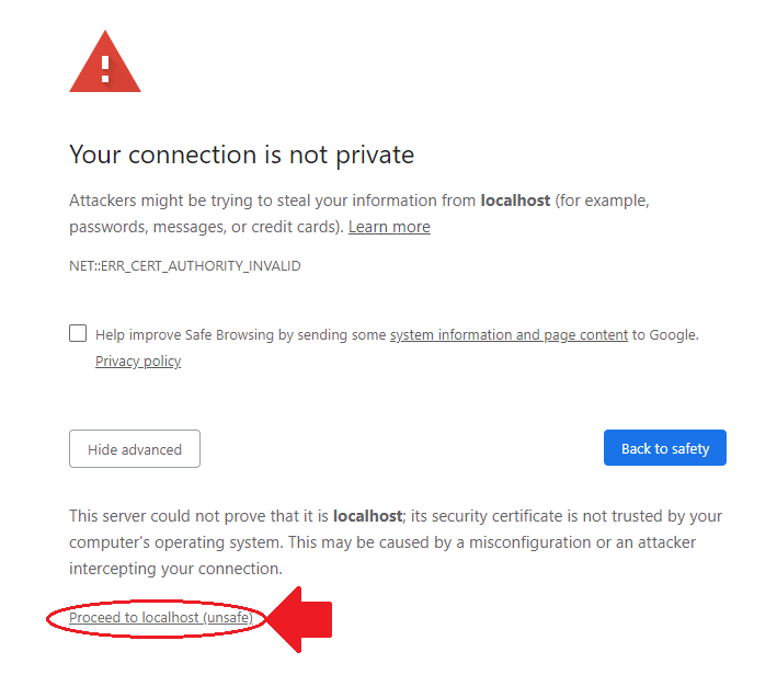
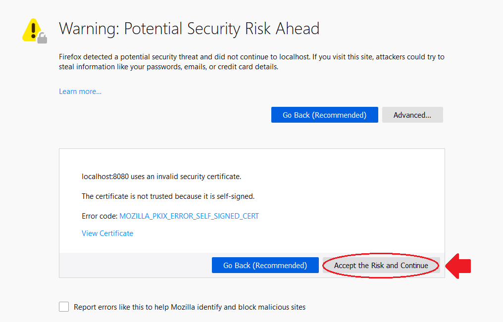
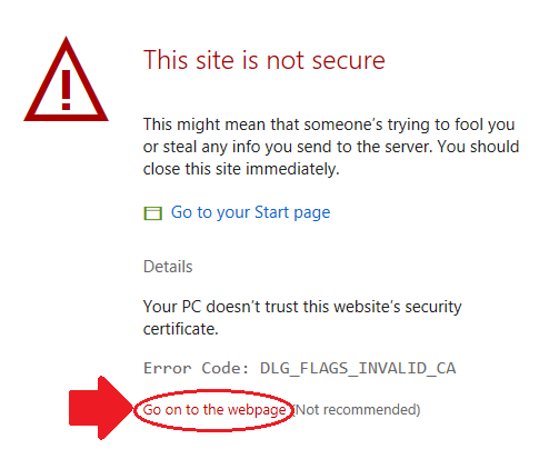
Add a browser security exception for the self-signed certificate
WARNING
As the development server uses an automatically generated self-signed certificate, the first time you launch it you'll get the following error messages dependant on which browser is set as default on your system:
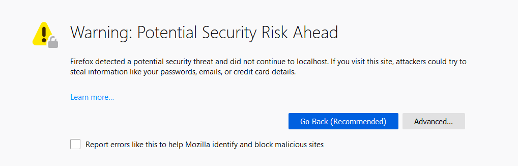
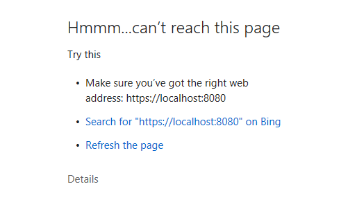
In order to overcome this error, you need open your local development server url (https://localhost:8080 in this case) and add a security exception in your browser to our development server self-signed certificate by clicking on the marked button of your browser's corresponding picture below.
After the security exception is added, we may relaunch your development server again, and we'll see our custom-report window displayed inside the LeanIX Pathfinder application.
Inspect our project source code folder
On a separate window, open the project root folder with the code editor of your choice. Our project folder should have a structure similar to the picture below:
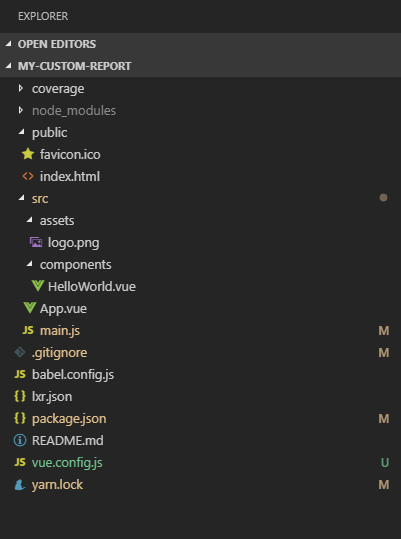
For our demo custom report, the relevant files to be edited are located inside the src folder. More specifically, we'll modify the main component file App.vue, and create a new component inside the src/components folder called ApplicationCard.vue.
Initialize the leanix-reporting framework
Our first coding task will be to tidy up our project's main component file, App.vue, in order to remove all irrelevant lines of code to our current project. We also declare two state variables, baseUrl and dataset, that will be used by our main component to store information retrieved from the leanix-reporting framework.
<template>
  <div id="app">
  </div>
</template>

<script>
export default {
  name: 'app',
  components: {},
  data () {
    return {
      baseUrl: '',
      dataset: []
    }
  }
}
</script>
Next, we add a created Vue lifecycle hook in which we initialize the leanix-reporting frameworkand receive the report setup that will be used to build our custom-report configuration:
<template>
  <div id="app">
  </div>
</template>

<script>
export default {
  name: 'app',
  components: {},
  data () {
    return {
      baseUrl: '',
      dataset: []
    }
  },
  created () {
    this.$lx.init()
      .then(setup => {
        const config = {}
        this.$lx.ready(config)
      })
  }
}
</script>
Afterwards we build our custom-report configuration. Notice that we also store the baseUrl extracted from the setup parameter provided by the lx.init() method, and we assign the facet callback result to our local state variable dataset:
<template>
  <div id="app">
  </div>
</template>

<script>
export default {
  name: 'app',
  components: {},
  data () {
    return {
      baseUrl: '',
      dataset: []
    }
  },
  created () {
    this.$lx.init()
      .then(setup => {
        const { settings = {} } = setup
        const { baseUrl } = settings
        this.baseUrl = baseUrl

        const config = {
          allowEditing: false,
          allowTableView: false,
          facets: [
            {
              attributes: ['id', 'name', 'description'],
              callback: dataset => {
                this.dataset = dataset
              },
              fixedFactSheetType: 'Application',
              key: 'applications',
              label: 'Applications'
            }
          ]
        }
        this.$lx.ready(config)
      })
  }
}
</script>
Finally we add a very simple visual feedback into our main component template so that we can confirm that the baseUrl and dataset variables are properly stored. We also apply default font style to our main component:
<template>
  <div id="app">
    <div>
      <strong>BaseURL:</strong> {{ baseUrl }}
    </div>
    <div>
      <strong>Application count:</strong> {{dataset.length}}
    </div>
  </div>
</template>

<script>
export default {
  name: 'app',
  components: {},
  data () {
    return {
      baseUrl: '',
      dataset: []
    }
  },
  created () {
    this.$lx.init()
      .then(setup => {
        const { settings = {} } = setup
        const { baseUrl } = settings
        this.baseUrl = baseUrl

        const config = {
          allowEditing: false,
          allowTableView: false,
          facets: [
            {
              attributes: ['id', 'name', 'description'],
              callback: dataset => {
                this.dataset = dataset
              },
              fixedFactSheetType: 'Application',
              key: 'applications',
              label: 'Applications'
            }
          ]
        }
        this.$lx.ready(config)
      })
  }
}
</script>

<style>
@import url('https://fonts.googleapis.com/css?family=Roboto+Condensed');

html, body {
  font-family: 'Roboto Condensed', sans-serif;
}
</style>
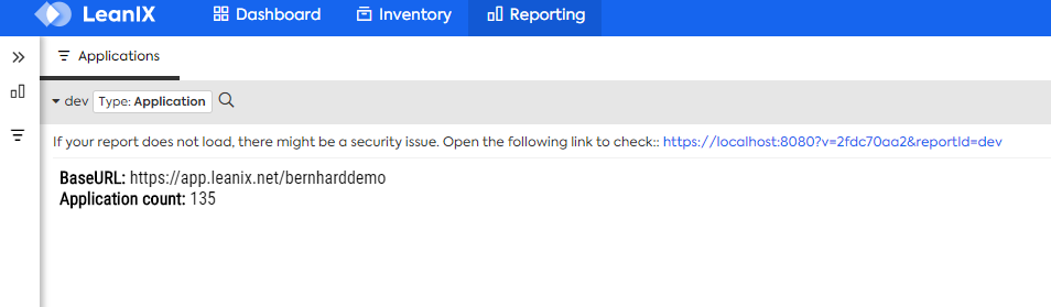
We should end up, for now, with both baseUrl and dataset.length variables printed in our custom-report.
Create the ApplicationCard component
Inside the src/components folder we create a file named ApplicationCard.vue and initialize it as follows:
<template>
</template>

<script>
export default {
  name: 'ApplicationCard'
}
</script>

<style>
</style>
Our ApplicationCard component will require an application object as a mandatory property.
<template>
</template>

<script>
export default {
  name: 'ApplicationCard',
  props: {
    application: {
      type: Object,
      required: true
    }
  }
}
</script>

<style>
</style>
From the application property, we will compute it's name and description as follows:
<template>
</template>

<script>
export default {
  name: 'ApplicationCard',
  props: {
    application: {
      type: Object,
      required: true
    }
  },
  computed: {
    name () {
      return this.application.name
    },
    description () {
      return this.application.description || 'no description provided'
    }
  }
}
</script>

<style>
</style>
We then define a layout for the application card template. Notice that we have not defined any styling yet!
<template>
  <div class="card">
    <div class="card-header elipsis">
      {{name}}
    </div>
    <div class="card-body block-elipsis">
      {{description}}
    </div>
  </div>
</template>

<script>
export default {
  name: 'ApplicationCard',
  props: {
    application: {
      type: Object,
      required: true
    }
  },
  computed: {
    name () {
      return this.application.name
    },
    description () {
      return this.application.description || 'no description provided'
    }
  }
}
</script>

<style>
</style>
And finally we apply a style to our ApplicationCard component:
<template>
  <div class="card">
    <div class="card-header elipsis">
      {{name}}
    </div>
    <div class="card-body block-elipsis">
      {{description}}
    </div>
  </div>
</template>

<script>
export default {
  name: 'ApplicationCard',
  props: {
    application: {
      type: Object,
      required: true
    }
  },
  computed: {
    name () {
      return this.application.name
    },
    description () {
      return this.application.description || 'no description provided'
    }
  }
}
</script>

<style>
  .card {
    background: #fff;
    border-radius: 2px;
    width: 200px;
    height: 150px;
    box-shadow: 0 1px 3px rgba(0,0,0,0.12), 0 1px 2px rgba(0,0,0,0.24);
  }

  .card-header {
    padding: 1rem;
    border-bottom: 1px solid grey;
    font-weight: bold;
    height: 20px;
  }

  .card-body {
    padding: 0.5rem;
  }

  /* truncates a single-line long text with ellipsis */
  .elipsis {
    white-space: nowrap;
    overflow: hidden;
    text-overflow: ellipsis;
  }

  /* truncates a 6-line long text with ellipsis */
  .block-elipsis {
    display: block;
    display: -webkit-box;
    max-width: 100%;
    height: 76px;
    margin: 0 auto;
    font-size: 14px;
    line-height: 1;
    -webkit-line-clamp: 6;
    -webkit-box-orient: vertical;
    overflow: hidden;
    text-overflow: ellipsis;
  }
</style>
Our ApplicationCard component is now ready to be rendered inside our custom-report main component!
Refactor the main component
With the ApplicationCard component defined, we can use it in our main component, App.vue, for rendering each dataset item as a card.
In order to do so, we need to import and declare it into the script section of our App.vue component as follows:
<script>
import ApplicationCard from './components/ApplicationCard'

export default {
  name: 'app',
  components: {ApplicationCard},
  ...
}
</script>
We then adjust the template section of the App.vue component to render correctly each ApplicationCardcomponent. Notice that we render recursively an ApplicationCard for each item in the dataset, while we wrap the whole set of ApplicationCards into a single .cards-container element.
<template>
  <div id="app">
    <div class="cards-container">
      <application-card
        v-for="application in dataset"
        :key="application.id"
        :application="application"/>
    </div>
  </div>
</template>
Finally we apply the style to our App.vue component.
<style>
@import url('https://fonts.googleapis.com/css?family=Roboto+Condensed');

html, body {
  font-family: 'Roboto Condensed', sans-serif;
  background: #e2e1e0;
}

.cards-container {
  display: flex;
  flex-flow: row wrap;
  justify-content: center;
}

.cards-container > .card {
  margin: 1rem;
}
</style>
And in the end we should come up with a result as follows:
🎉 Congratulations, you've just implemented your first LeanIX custom-report using Vue! 🎉